Cart
0
7 Timeless Design Principles Every Beginner Needs to Know

Stop chasing trends. Master these fundamentals instead, and your space will always look right.
I get it. You're scrolling through Pinterest at 2 AM, saving everything that catches your eye—neon accent walls one minute, maximalist gallery walls the next. But here's what I've learned after years of designing (and redesigning) spaces: the most beautiful homes aren't the ones following every trend. They're the ones that understand the basics.
These seven principles have been quietly working behind the scenes in every stunning room you've ever admired. Master them, and you'll never second-guess your decorating decisions again.
1. Balance: Why Some Rooms Just Feel Right

You know that feeling when you walk into a space and everything just clicks? That's balance at work. It's not about making everything perfectly symmetrical—it's about making sure no corner of your room is screaming for attention while another gets ignored.
Symmetrical balance is your safe bet. Two matching lamps flanking a sofa, identical nightstands, centered artwork—it's classic for a reason. Your brain loves this stuff.
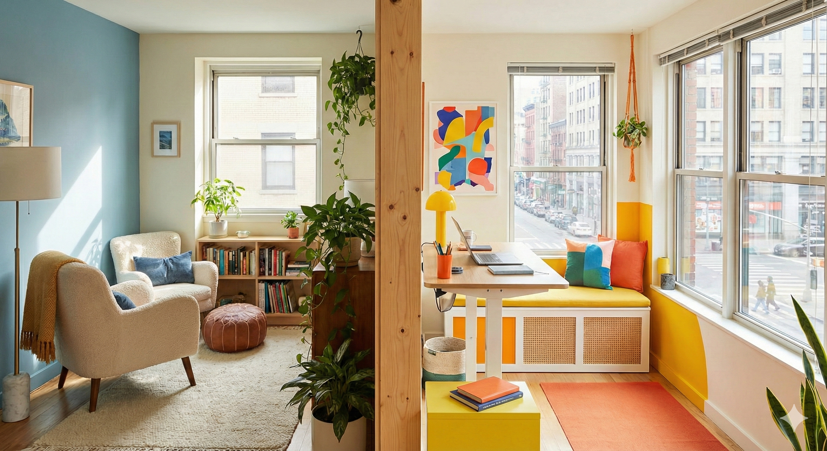
Asymmetrical balance is where things get interesting. Maybe you balance a hefty bookshelf with a cluster of plants and a floor lamp on the other side. Different objects, same visual weight. It feels more relaxed, more lived-in.
Radial balance happens when everything revolves around a center point—think chairs gathered around a coffee table or a chandelier anchoring a dining room.
*Quick check: Stand in your doorway and squint. Does one side of the room feel heavier? If yes, it's time to redistribute.*
2. Contrast: The Secret to Rooms That Pop

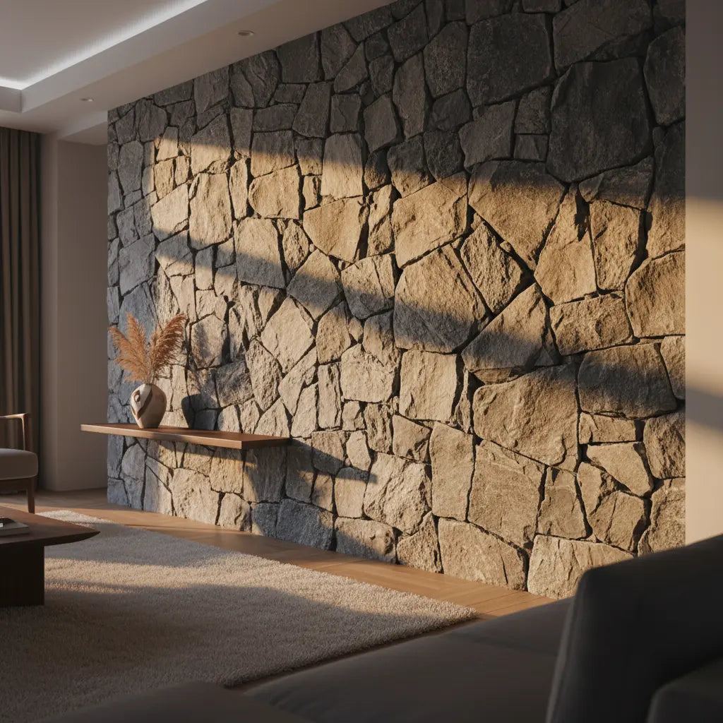
Contrast is what separates boring from breathtaking. Without it, everything blends into beige background noise. But add some drama—dark wood against white walls, a plush velvet chair next to a sleek metal table—and suddenly your room has personality.
You can create contrast with colors (obviously), but don't stop there. Mix textures—smooth marble with rough jute, glossy ceramics with matte wood. Play with shapes too. That round mirror above your angular console? *Chef's kiss.*
The key is not going overboard. Pick one or two ways to create contrast and commit to them throughout the space.
3. Rhythm: Teaching Your Eye Where to Go

This one sounds fancy, but it's actually pretty simple. Rhythm is just repetition with purpose. It's how you guide someone's eye around the room without them realizing you're doing it.
Maybe you repeat the same shade of blue in your throw pillows, artwork, and a ceramic vase. Or you echo circular shapes in your mirror, side table, and pendant light. Your eye picks up on these repeated elements and follows them naturally through the space.
The trick is varying the scale and placement so it doesn't feel like you bought everything from the same display at the store. Repeat, but make it interesting.
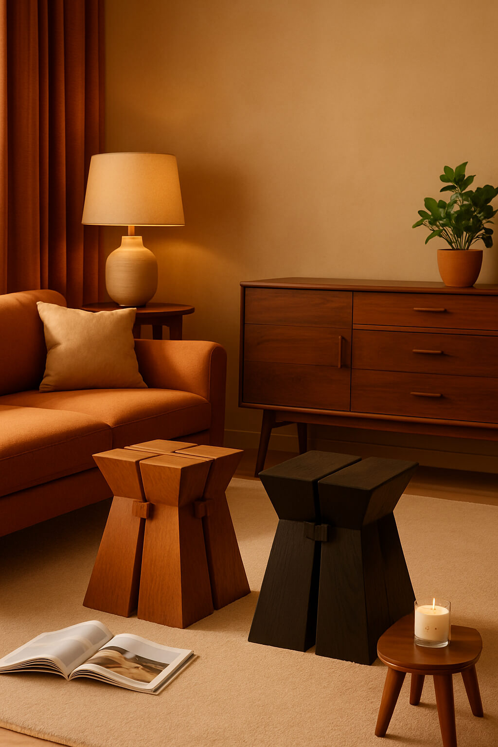
4. Proportion & Scale: Getting the Goldilocks Effect


Examples of a rooms with wrong proportions.
We've all been there—buying a coffee table online that looked perfect in the photo, only to have it arrive and look like dollhouse furniture in your actual living room. Or the opposite: that "cozy" sectional that turns your space into a furniture showroom.
Scale is about how things relate to your room. Proportion is about how they relate to each other. A tiny lamp on a massive console looks lost. A huge lamp on a delicate side table looks ridiculous. But get both right, and everything feels intentional.
*Pro tip: Before you buy anything substantial, mark out its footprint on your floor with painter's tape. Trust me on this one.*
5. Unity: Making It All Make Sense

Unity is what transforms a collection of furniture into a cohesive room. It's the thread that ties everything together so it feels like it belongs, not like you furnished your space by closing your eyes and pointing at random items.
This doesn't mean everything has to match—that's boring. But there should be some common element weaving through your choices. Maybe it's a consistent color palette, or you're mixing metals but sticking to warm brass and copper. Maybe all your wood tones are in the same family, or you're repeating a certain style of leg on different furniture pieces.
Whatever your unifying element is, it should be subtle enough that guests feel the harmony without being able to put their finger on exactly what creates it.
6. Emphasis: Give Your Room a Star

Every room needs a focal point—that one thing your eye lands on first when you walk in. Without it, your space lacks direction and feels scattered.
Your focal point might be architectural (a fireplace, a statement wall), or it might be something you add (bold artwork, a show-stopping light fixture, an accent wall in a rich color). The key is having just one main star per room, with everything else playing supporting roles.
Once you've chosen your focal point, arrange everything else to complement it, not compete with it. That gorgeous gallery wall loses its impact if there's also a neon pink sofa and a crystal chandelier fighting for attention.
7. Functionality: Pretty Should Also Be Practical

Here's the thing nobody tells you about those magazine-perfect rooms: half of them would be miserable to actually live in. Beautiful design that doesn't work for your real life isn't good design—it's just pretty pictures.
Think about how you actually use your space. Can you easily walk through it? Is there enough light for reading? Do you have places to put your stuff that aren't just "throw it on the dining table"?
The most timeless rooms are the ones that make daily life easier and more enjoyable. That's what keeps them relevant long after the trends move on.
The Bottom Line
These principles aren't rules you have to follow perfectly—they're tools that help you make better decisions. Once you understand them, you'll start seeing them everywhere, in every space that makes you think "I wish my place looked like this."
The best part? You probably already have good instincts about most of this stuff. These principles just give you the vocabulary to understand why something works and the confidence to trust your own judgment.
So next time you're tempted to completely overhaul your space because you saw something cool on Instagram, take a step back. Look at what you already have through the lens of these seven principles. Sometimes the difference between "fine" and "fantastic" is smaller than you think.
*What's the first principle you want to tackle in your own space? I'd love to hear about your wins (and your design disasters) in the comments below.*