Carrito
0
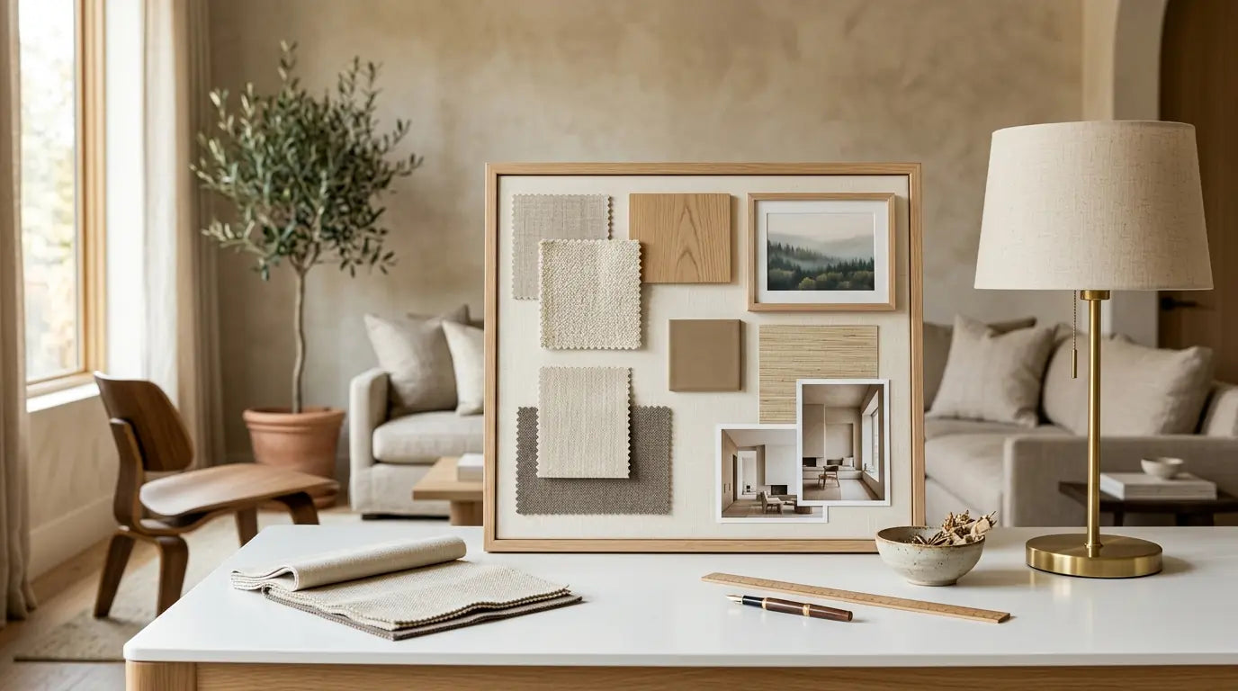
This post is part of our complete Interior Design Principles series. If you missed our previous posts on proportion and scale, rhythm and repetition, balance and harmony, and the core design concepts, be sure to check those out first!
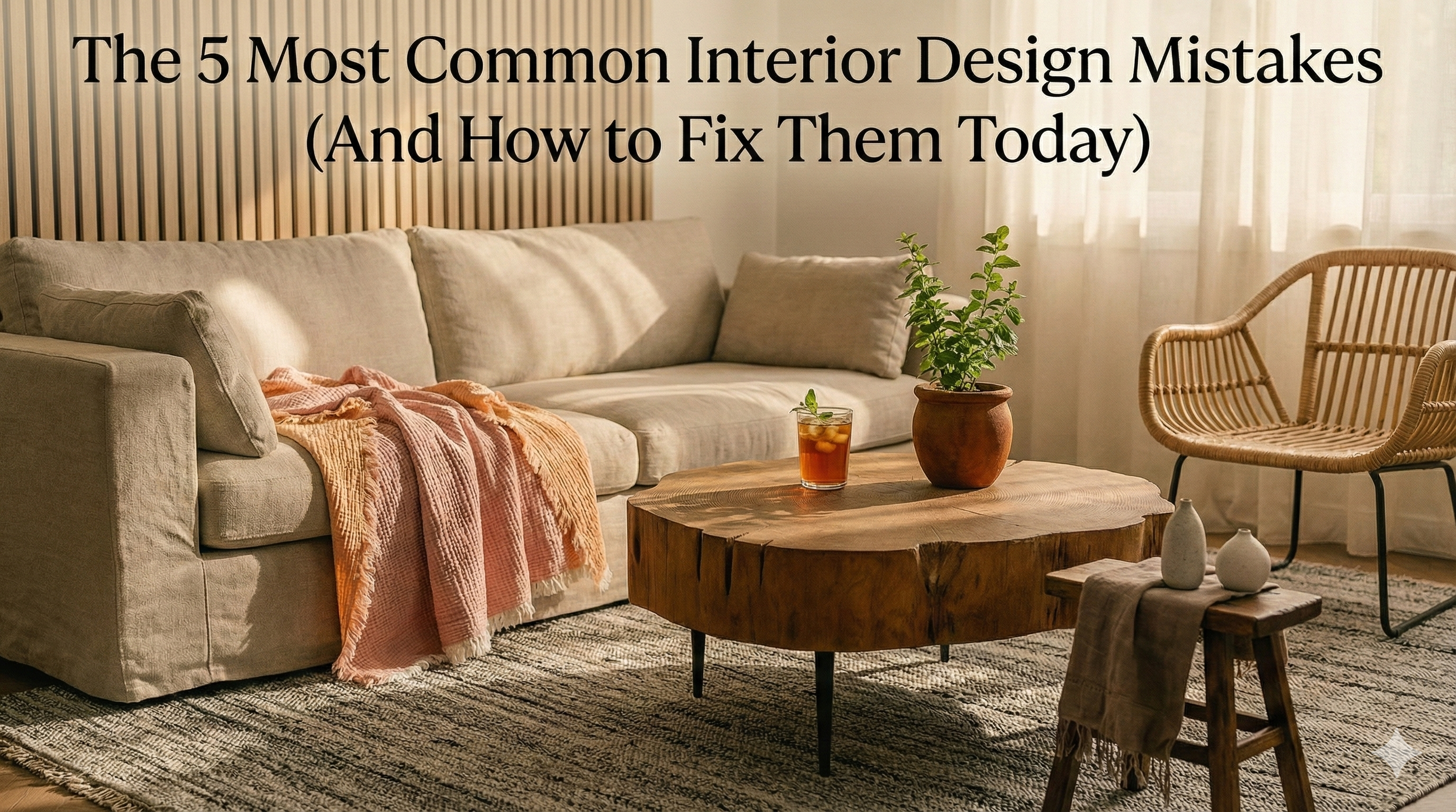
You spend hours picking out furniture. You choose the perfect paint color. You arrange everything carefully. But when you step back and look at the room... something still feels wrong.
Most people make the same five design mistakes over and over. The good news? Every single one has a simple fix.
Here I'm going to show you exactly what's making your room feel "off" and how to fix it—starting this weekend.
Why Do We Keep Making These Mistakes?

Shop Japan Imported Mino Burning Tang Grass Cherry Blossom 8.45oz
Before starting, let's go through the reasons why these mistakes happen so often.
First, when you visit the showroom, they make everything look perfect. They do this by having a lot of space and high ceilings, to get more control over the scale and proportions. But when it gets home in a regular-sized living room, it feels completely different.
Second, we tend to paint first and buy furniture second. This limits us creatively by having to match the colors in the wall.
And third, the lighting, we rely too much on overhead lighting. But good lighting takes planning and layers.
Being aware and recognizing these patterns is what will help you avoid them. Now lets look a each mistake and how to fix it.
Mistake #1: Using Only One Light Source (Usually That Awful Ceiling Light)

Most people decorate their living rooms with one ceiling light fixture in the middle. This is the biggest mistake people make with lighting.
Why It's a Problem
Here's the problem, a single overhead light creates harsh shadows and uneven lighting throughout the your room. Designers factor in how light travels on every area of the room to be intentional in how it turns out.
A single fixture makes the room feel unwelcoming. It creates dark corners. I casts shadows on people's faces making them look awkward. It can't help you read or perform focus tasks. And they don't help you highlight your focal points.
Even nice furniture can't overcome bad lighting, and their beauty is minimized by the lack of it.
The Fix: Layer Your Lighting
Good lighting has three layers working together:
Layer 1 - Ambient Lighting (General Light). These are the recessed lights, ceiling fixtures or wall sconces. This light helps you see and move throughout the room. Think of it as the base layer.
Layer 2 - Task Lighting (Functional Light) This is the light used to perform tasks. It can be a table lamp next to a reading chair, a pendant light over a kitchen island, under-cabinet lights for cooking, etc... They illuminate a specific area to help you do things better.
Layer 3 - Accent Lighting (Decorative Light) This layer creates mood and highlights special features. For example, light over artwork, a focal point, plants, sculptures, etc... This layer is used to highlight things so they attract attention.
Real-World Example
Interior designers recommend using "floor lamps, wall sconces, and pendant lights" together to create warmth. A well-designed bedroom might have recessed ceiling lights, bedside table lamps for reading, and maybe a floor lamp in the corner. That's three different light sources at three different heights.
Your Action Steps:
This weekend: Add at least two lamps to any room that only has ceiling lights. Put them at different heights.
This month: Install dimmer switches on your overhead lights. This lets you control the mood.
Choose warm bulbs: Look for bulbs marked "2700K" or "warm white." These give off soft, flattering light instead of harsh blue light.
Place lights strategically: Put table lamps where you actually sit. Position floor lamps in corners or next to chairs.
How Many Lights Do You Need?
A good rule of thumb: Every room needs at least three light sources. More for larger rooms. Think about a typical bedroom: ceiling light (ambient), bedside lamps (task), and maybe a decorative floor lamp (accent). That's three sources working together.
Mistake #2: Pushing All Your Furniture Against the Walls

This might be the most natural mistake we all make. You get new furniture and your first instinct is to push everything against the walls. It seems like you're creating more space, right?
Wrong.
Why It's a Problem
Interior designers at Good Housekeeping explain that pushing furniture against walls can make rooms feel smaller and disjointed.
When all your furniture is stick to the walls, several problems happen:
- The center of the room becomes unused space
- Your seating feels too far apart for comfortable conversation
- The room looks stiff and unwelcoming
- Your beautiful furniture pieces fade into the background
Design experts note that this layout "limits social interaction, creates awkward empty zones, and disrupts comfortable movement through a space."
The Fix: Float Your Furniture
Pull your furniture a few inches away from the walls.
For Large Rooms:
- Float your sofa into the middle of the room, facing your focal point (fireplace, TV, or window)
- Create a conversation circle by arranging chains to face the sofa
- Leave 6-12 inches between furniture and walls
- Use an area rug to anchor the seating group together
For Small Rooms: Smaller spaces are a but different, is okay to put the couch against the room on those cases. But try to float other elements like the accent chairs.
The Behind-the-Sofa Solution: If the sofa goes againt the wall, you can add a console table behind it. It can keep 1-2 inches of space while giving an area to store and display making it feel more intentional.
Real-World Example
According to furniture layout experts, when they removed a wall and created a larger living room, they "struggled to figure out the best layout" until they "decided to float the couch in the middle of the room and ground it with a rug." The result? The room went from feeling empty and disconnected to cozy and intentional.
Your Action Steps:
This weekend: Try pulling your sofa 12-18 inches away from the wall. Live with it for a week before deciding.
Create zones: In open-plan spaces, use floating furniture to define different areas (living zone, dining zone, reading nook).
The conversation test: Can you comfortably talk to someone sitting across from you without raising your voice? If not, bring the furniture closer together.
Leave walking space: Maintain 30-36 inches of clear pathways for traffic flow.
Mistake #3: Too Many Decorations (Making Your Home Feel Like a Gift Shop)
Sometimes we buy decorative items thinking more is better. But instead, we end up with surfaces covered in stuff and walls full of frames.
Why It's a Problem
Overdecorating creates rooms where many things compete for attention, and this clutter actually obstructs the beauty.
When you have too many decorations:
- Your eye doesn't know where to look
- Special pieces lose their impact
- Rooms feel cluttered even when they're clean
- Surfaces become unusable (covered in knickknacks)
- The room feels chaotic instead of peaceful
Also research shows that clutter leads to stress and lack of focus. So when we do this we're actually triggering anxiety in people.
The Fix: Edit Ruthlessly
The solution isn't to remove everything. It's to curate what you display.
The Pile Method:
Interior design professionals recommend this practical approach:
- Clear everything: Take all decorations from one room and pile them in the center
- Question each piece: Does this lift your mood? Do you love looking at it? Or do you feel obligated to keep it?
- Make two piles: Keep and donate
- Put back less: Only return items you genuinely love
Rules for Better Decorating:
Wall Decor: Leave some walls blank. Not every wall needs art. Instead focus on the intention behind your design, what you want people to see. Design experts suggest "leaving walls with a few feet of space between décor" and "using larger prints" instead of many small ones.
Surface Styling: Coffee tables, nightstands, and counters attract clutter. Keep flat surfaces mostly clear. Use the "rule of three"—group items in sets of three for visual appeal without overcrowding.
Collections: If you collect things, display them intentionally. Put your favorite pieces in glass cabinets or on dedicated shelves. Rotate what you display seasonally instead of showing everything at once.
The Breathing Room Principle:
When there are fewer items competing for attention, the best piece can stand out.
Your Action Steps:
This weekend: Clear one surface completely (coffee table, mantel, or kitchen counter). Add back only 1-3 meaningful items.
The gallery wall audit: If you have walls covered in frames, remove half. Leave for a week. You'll probably like it better.
Seasonal rotation: Box up half your decorations. Swap them out every few months for a fresh look.
Quality over quantity: One beautiful, large piece of art makes more impact than ten small pieces.
Mistake #4: Wrong Rug Size (The Floating Furniture Look)
This was covered in our proportion and scale post, but it's so common it deserves another mention. Tiny rugs are actually the easiest fix for the biggest visual difference.
Why It's a Problem
Small rugs make furniture feel like it's floating in space. They visually shrink the room and make everything feel disconnected and cheap.
A small room in a big space fails because it doesn't anchor the furniture together.
The Fix: Size Up Dramatically

Shop Breathable Cotton Throw Blanket - Cozy & Versatile
Most people need rugs 2-3 times bigger than most people usually think. Here's some rules to make the right choice.
Living Room Rug Rules:
Minimum: Keep the Front legs of all major furniture (sofa and chairs) on top of the rug
Better: Keep all four legs of furniture over the rug
Best: Have a rug that extends 6-18 inches beyond furniture on all sides
Real Size Guide:
- Small living room (10x12 feet): 8x10 rug minimum
- Medium living room (12x15 feet): 9x12 rug minimum
- Large living room (15x18 feet): 10x14 rug or larger
Dining Room Rug Rules:
- Rug should extend 24-30 inches beyond the table on all sides
- This ensures chairs can pull out while staying on the rug
- Round tables need round rugs (or square rugs rotated 45 degrees)
Bedroom Rug Rules:
- Rug should extend 24 inches beyond bed on sides and foot
- Or place two runners on either side of the bed
Your Action Steps:
Measure before shopping: Bring a tape measure and measure your space. Don't guess.
Use painter's tape: Mark the rug size on your floor before buying. This shows you real size.
When in doubt, size up: A rug that's too big looks luxurious. A rug that's too small looks cheap.
Budget tip: If large rugs are expensive, layer a smaller decorative rug over a larger, cheaper jute or sisal rug.
Mistake #5: Ignoring Scale and Proportion

This is about getting the sizes right. Tiny furniture in big rooms. Huge furniture in small rooms. Little lamps on big tables. It all adds up to rooms that feel "off."
Why It's a Problem
When scale and proportion are wrong, rooms feel uncomfortable even when you can't pinpoint why. Your brain knows something doesn't match, and it creates visual tension.
Common scale mistakes include:
- Art that's too small above the sofa
- Lamps that are tiny on large nightstands
- Coffee tables that are too low or too high
- Chandeliers that overpower small dining tables
- Accent chairs that look lost in large rooms
The Fix: Use These Formulas

Shop Linen Meditation Cushion 23" and 18"
Art Above Sofa:
- Should be 2/3 the width of the sofa
- 7-foot sofa needs 56-inch-wide art minimum
Coffee Table:
- Should be 2/3 the length of your sofa
- Height: 1-2 inches lower than sofa seat
Nightstand:
- Same height as top of mattress (or 2 inches shorter)
- Table lamp should be 1/3 the width of nightstand
Chandelier Over Dining Table:
- Diameter should be 1/2 to 2/3 the table width
- Hang 30-36 inches above table surface
Room Chandelier:
- Add room length + width in feet
- That number in inches = fixture diameter
- Example: 12x14 room = 26-inch fixture
Your Action Steps:
This weekend: Measure your sofa and your wall art. Is the art at least 2/3 the sofa width? If not, plan to create a gallery wall or find larger art.
The photograph trick: Take photos of your rooms. Pictures reveal proportion problems you don't notice in person.
Before buying anything: Measure the space AND the item. Bring measurements to the store on your phone.
Use painter's tape: Mark furniture footprints on your floor before purchasing to see real size.
How to Fix Multiple Mistakes at Once
Maybe you're looking at your room and thinking, "I'm making ALL five of these mistakes!" Don't panic. You don't need to fix everything overnight.
Your Priority Order:
Week 1 - Lighting: Add 2-3 lamps to rooms that only have ceiling lights. This is the fastest, cheapest fix with the biggest impact. You can find decent lamps for $30-50 each.
Week 2 - Clutter: Remove half your decorations. Box them up. You can always add them back, but you probably won't want to.
Week 3 - Furniture Arrangement: Try floating your sofa away from the wall. Move chairs closer together. Create an intimate conversation area.
Week 4 - Rug Check: Measure your rug and furniture. Is it big enough? If not, start saving for the right size. This is worth the investment.
Month 2 - Scale and Proportion: Measure art, lamps, and tables. Make a list of items that are the wrong size. Replace them gradually as budget allows.
The Real Secret: It's About How the Room Feels
Here's what all these mistakes have in common: They make rooms feel uncomfortable, unwelcoming, or just "off" without you knowing exactly why.
Good design isn't about following rules perfectly. It's about creating spaces where you actually want to spend time. Spaces that feel balanced, comfortable, and intentional.
When you fix these five mistakes, you'll notice:
- Rooms feel more spacious (even without changing furniture)
- Spaces become more inviting and comfortable
- Your home looks more expensive and intentional
- You actually want to spend time in these rooms
- Guests comment on how great everything looks
What's Next in Our Series
In our next post, we'll dive into the psychology of space—how design influences your mood and how to design rooms that make you feel calm, energized, or focused. We'll explore color psychology, natural light, and the concept of "prospect-refuge" theory.
Want to catch up on the series? Check out our previous posts on proportion and scale, rhythm and repetition, balance and harmony, and design elements vs. principles. Subscribe so you don't miss the rest of our Interior Design Principles series!