Carrito
0
This post is part of our complete Interior Design Principles series. If you missed our previous posts on common design mistakes, proportion and scale, rhythm and repetition, and balance and harmony, be sure to check those out first!
Close your eyes and imagine yourself in a tiny, windowless room with harsh fluorescent lights and gray walls. How do you feel? Stressed? Uncomfortable? Maybe even a little trapped?
Now imagine a bright room with big windows, soft natural light, plants in the corners, and walls painted a calming blue-green. Feel the difference?
That's the psychology of space at work. Your rooms aren't just pretty backgrounds for your life—they're actively changing how you feel, think, and even sleep.
Today we're diving into the fascinating science of how design affects your mood. We'll explore color psychology, the power of natural light, and why some rooms make you feel safe while others make you anxious.
Why Your Space Affects Your Mood (The Science Part, Made Simple)

Here's something wild: We spend about 90% of our time indoors. That means the rooms around you are basically running your life.
Your brain is constantly scanning your environment. It's checking: Am I safe here? Is this a good place to rest? Should I be alert right now? And it makes these decisions based on what it sees, feels, and senses in your space.
Design researchers explain (https://italdoors.com/home-design-blog/the-psychology-of-interior-design-how-colors-and-layout-affect-mood/) that "interior design is more than just an aesthetic choice—it is a powerful tool that shapes how we feel, think, and behave in our daily lives."
Every design choice you make sends signals to your brain:
- Colors trigger emotional responses before you even consciously register them
- Light levels tell your body whether to wake up or wind down
- Room layouts determine whether you feel exposed or protected
- Textures and materials communicate warmth or coldness
Understanding these connections means you can intentionally design rooms that make you feel exactly how you want to feel.
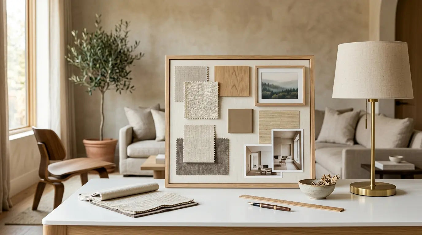
The Power of Color: More Than Just Pretty Walls
Color isn't decoration. It's energy. Different colors literally affect your heart rate, blood pressure, and hormone levels.
Research in university residence halls (https://pmc.ncbi.nlm.nih.gov/articles/PMC6120989/) studied students living in buildings with different colored interiors. They found that "blue as interior color was considered to facilitate studying activity" and students reported feeling calmer in blue rooms.
Here's what different colors actually do to your brain:
### Blue: The Calming Champion

Blue is the world's favorite color for good reason. It's the color of sky and water—things that signal safety to our ancient brains.
What It Does:
- Lowers your heart rate and body temperature
- Reduces feelings of anxiety
- Helps with focus and concentration
- Promotes better sleep
Where to Use It:
Perfect for bedrooms, bathrooms, and home offices where you need to concentrate. Design experts note (https://www.sherwin-williams.com/en-us/project-center/paint/color-psychology) that "blue is soothing and relaxing—it's perfect for bedrooms and bathrooms."
The Catch:
Too much dark blue can feel cold or depressing. Stick with soft, muted blues for relaxation. Use deeper navy when you want focus and authority, like in an office.
### Green: Nature's Balance
Green is special because your eyes process it easier than any other color. You can stare at green all day without getting tired.
What It Does:
- Creates feelings of balance and harmony
- Reduces eye strain (seriously—it's the easiest color for your eyes to see)
- Connects you to nature, which lowers stress
- Helps you feel refreshed and restored
Where to Use It:
Living rooms, reading nooks, and any space where you spend lots of time. Color psychology research shows (https://www.designcafe.com/blog/home-interiors/colour-psychology-in-interior-design/) that "with its association with nature and the great outdoors, green instills a sense of harmony and balance."
Pro Tip:
Sage green and mint green feel soothing. Olive and forest green feel sophisticated and grounding. You really can't go wrong with green.
### Yellow: Sunshine in a Can

Yellow mimics natural sunlight. It literally tricks your brain into feeling like the sun is shining.
What It Does:
- Boosts mood and creates feelings of happiness
- Stimulates mental activity and creativity
- Makes dark spaces feel brighter
- Increases energy levels
Where to Use It:
Kitchens, breakfast nooks, and rooms that don't get much natural light. Designers recommend (https://www.sherwin-williams.com/en-us/project-center/paint/color-psychology) that "yellow reflects light, making it an excellent choice for foyers and dark hallways."
The Warning:
Bright, intense yellow can actually increase anxiety and make babies cry more (no joke—studies prove it). Use soft, buttery yellows instead of electric lemon shades.
### Red: The Energizer

Red is the most physically stimulating color. It actually raises your blood pressure and heart rate.
What It Does:
- Creates feelings of excitement and passion
- Increases energy and alertness
- Stimulates appetite (which is why so many restaurants use it)
- Demands attention
Where to Use It:
Dining rooms, workout spaces, or as small accents in social areas. Color experts warn (https://www.ducydesign.com/blog/the-emotional-impact-of-color-psychology-in-interior-design) that while "red evokes feelings of passion, energy and intimacy," it can also "cause restlessness or aggression" if overused.
The Rule:
Never paint an entire bedroom red unless you want to stare at the ceiling all night. Use it as an accent color—pillows, artwork, a single wall—not the whole room.
### Neutral Colors: The Peaceful Foundation

White, gray, beige, and taupe might seem boring. But they're secretly the most important colors in your home.
What They Do:
- Create feelings of calm and serenity
- Make small spaces feel larger
- Let other elements (furniture, art) stand out
- Provide visual rest for your brain
Where to Use Them:
Everywhere, as your base. Design psychology research confirms (https://www.decorilla.com/online-decorating/interior-design-color-psychology/) that "neutral tones like gray and white usually leave people feeling serene."
The Smart Strategy:
Use neutral walls and add color through pillows, rugs, art, and accessories. This lets you change the mood without repainting.
Light: The Most Important Design Element You're Probably Ignoring
If you only fix one thing in your home after reading this, fix your lighting. It's that important.
Light controls your circadian rhythm—your body's internal clock that tells you when to wake up, when to feel alert, and when to sleep.
### Why Natural Light Changes Everything

Natural light isn't just nice to have. It's essential for your mental health.
Research on natural light (https://imidesignstudio.com/benefits-letting-natural-light-home/) found that "sunlight boosts our production of endorphins and serotonins, the chemicals that make us feel happy." People with more natural light in their homes:
- Sleep better at night
- Feel less depressed
- Have more energy during the day
- Concentrate better on tasks
Action Steps for More Natural Light:
1. Remove heavy curtains - Replace them with sheer, light-filtering options
2. Keep windows clean - Sounds obvious, but dirty windows block 30-40% of light
3. Use mirrors strategically - Place them across from windows to bounce light around
4. Paint walls lighter colors - They reflect more light than dark colors
5. Move furniture away from windows - Don't block your light sources
### The Color Temperature Secret (This Will Blow Your Mind)
All light has a "color temperature" measured in Kelvins (K). This completely changes how light affects your mood and body.
Circadian lighting experts explain (https://www.lovethatdesign.com/article/circadian-rhythm-why-and-how-should-it-be-considered-in-interior-lighting/) that "by using cooler, bluish light during the day and warmer, reddish light in the evening, circadian lighting helps to reinforce our natural circadian rhythm."
Warm Light (2700K - 3000K)
- Color: Yellow/orange, like sunset or candlelight
- Effect: Promotes relaxation, signals your brain that day is ending
- Best for: Bedrooms, living rooms, evening spaces
- Helps with: Falling asleep, unwinding, feeling cozy
Neutral Light (3500K - 4500K)
- Color: Crisp white, like morning sun
- Effect: Balanced—neither energizing nor sedating
- Best for: Kitchens, bathrooms, general spaces
- Helps with: Daily tasks, getting ready in the morning
Cool/Daylight (5000K - 6500K)
- Color: Bright white with blue tint, like midday sky
- Effect: Increases alertness, stops melatonin production
- Best for: Home offices, study areas, task lighting
- Helps with: Focus, concentration, staying awake
The Critical Rule:
Human-centric lighting research shows (https://www.alconlighting.com/blog/lighting-design/human-centric-lighting-design-principles/) that we should "start the day with at least an hour of daylight" to set our internal clock, then transition to warmer light in the evening.
Using bright, blue-toned light at night confuses your brain and destroys your sleep. This is why phone screens keep you awake—they emit blue light that tells your brain it's daytime.
### How to Layer Your Lighting (The Professional Way)
Remember from our mistakes post: One overhead light is design suicide. You need three layers working together.
Layer 1 - Ambient (General) Lighting
Your base layer. Provides overall illumination. This can be recessed lights, a ceiling fixture, or even well-placed floor lamps.
Layer 2 - Task Lighting
Focused light for specific activities. Table lamps for reading. Desk lamps for working. Under-cabinet lights for cooking.
Layer 3 - Accent Lighting
The mood-setter. Picture lights, LED strips, candles, decorative lamps. This layer makes your space feel designed instead of basic.
Real Example:
A bedroom should have:
- Soft overhead ambient lighting (dimmable)
- Bedside table lamps for reading (task)
- Maybe a decorative floor lamp or string lights (accent)
- All using warm bulbs (2700K) to support sleep
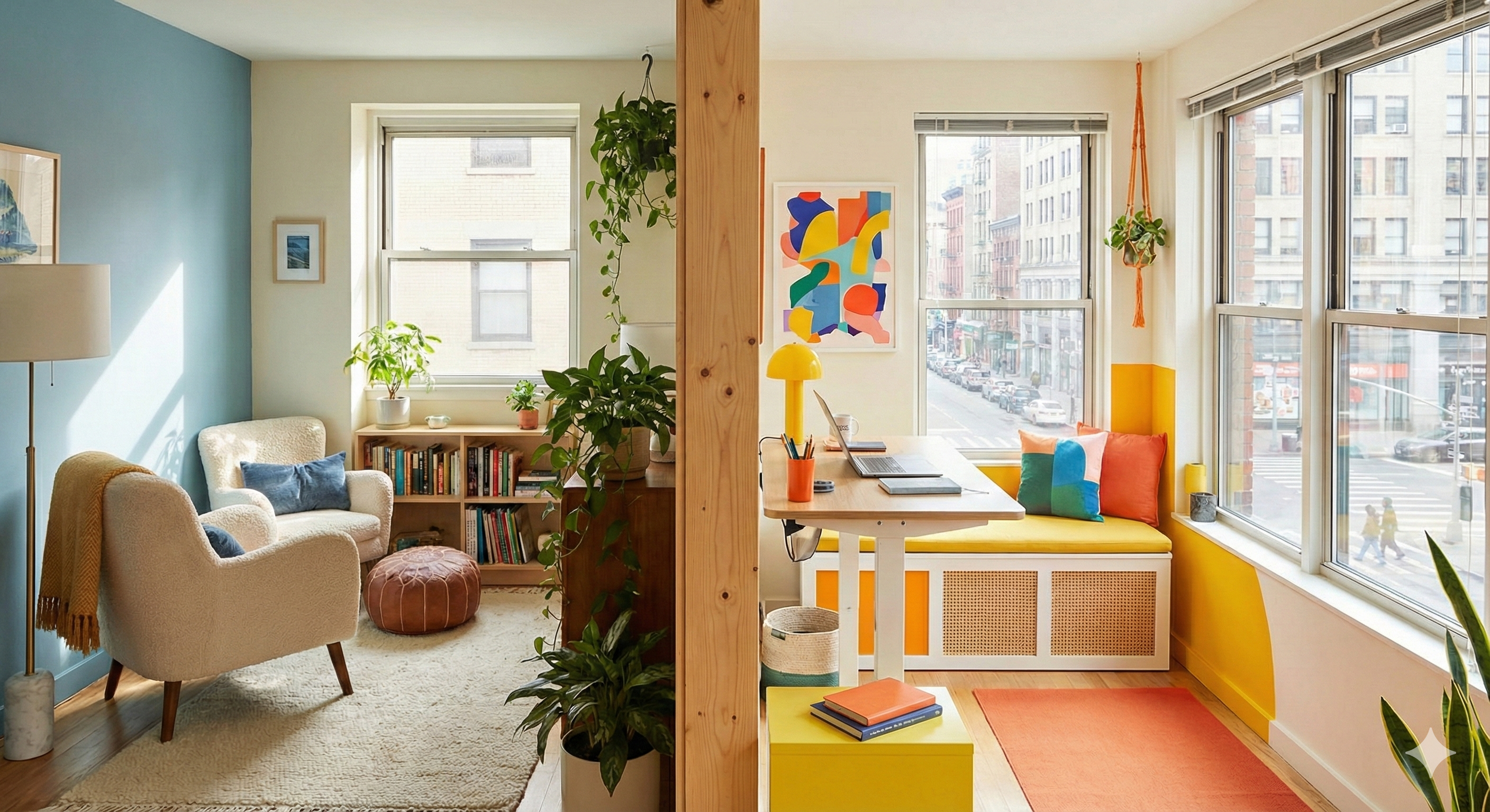
Prospect and Refuge: Why Some Seats Feel Better Than Others

Ever notice how everyone fights for the corner booth at restaurants? Or how you automatically choose the seat with your back to the wall?
That's your ancient brain seeking "prospect and refuge."
These terms come from evolutionary psychology. Our ancestors survived by finding spots where they could:
- Prospect: See danger coming (open views, clear sightlines)
- Refuge: Hide from danger (protection for their back, shelter overhead)
Interior designers use this principle constantly, often without realizing it.
### How to Use Prospect-Refuge in Your Home
Create "Safe" Seating:
- Position sofas and chairs with backs against walls
- Arrange seating to face entryways (so you see people coming)
- Use high-backed furniture or wingback chairs for extra "refuge"
- Avoid making people sit with their backs to doors
The Power of Nooks:
Small, enclosed spaces feel incredibly comforting because they provide maximum refuge. This is why:
- Reading nooks with three walls feel cozy, not cramped
- Breakfast nooks in corners are so appealing
- Bed canopies make sleeping feel more secure
- Kids love forts and enclosed play spaces
Balance Open and Closed:
Open floor plans are popular, but they can feel stressful because there's too much "prospect" (you're exposed) and not enough "refuge" (nowhere to hide).
Design solutions:
- Use bookcases or screens to create some visual barriers
- Add tall plants to break up sightlines
- Create distinct zones with area rugs
- Provide "escape" spaces like a cozy chair in a corner
The Mood You Want: Practical Design Recipes
Let's put all this together. Here's how to design for specific feelings.
### Design for Calm and Relaxation

Goal: Lower stress, promote rest, help your nervous system relax
Colors:
- Soft blue-gray, sage green, lavender, warm beige
- Keep saturation low (muted, not bright)
- Avoid red, orange, and bright yellow
Lighting:
- Warm bulbs only (2700K)
- Multiple soft light sources at low levels
- No harsh overhead lights
- Add dimmer switches
Layout:
- High refuge: backs protected, enclosed feeling
- Lower ceiling or canopy effect
- Comfortable, soft seating
- Face windows for nature views
Bonus Elements:
- Add plants for biophilic connection
- Use soft textures (velvet, wool, cotton)
- Include calming scents like lavender
- Remove clutter and visual noise
Best Rooms: Bedrooms, reading corners, meditation spaces
### Design for Focus and Productivity
Goal: Stay alert, concentrate deeply, maintain energy
Colors:
- Deep blue, clean white, green, or light gray
- Medium saturation (not too dull, not too bright)
- Avoid warm tones that make you sleepy
Lighting:
- Cool daylight bulbs (4000K-5000K) during work hours
- Bright, even illumination
- Natural light if possible
- Task lighting on work surface
Layout:
- Balanced prospect: see your space but have a solid wall behind you
- Organized, clear desk with minimal distractions
- Face away from beds or relaxation areas
- Keep work zone separate from rest zones
Bonus Elements:
- A small plant on your desk for "micro-breaks"
- Clean, uncluttered surfaces
- Good air circulation
- Sound masking or white noise to block distractions
Best Rooms: Home offices, study areas, workspaces
### Design for Creativity and Social Connection

Goal: Feel inspired, encourage conversation, spark new ideas
Colors:
- Warm accent colors (yellow, orange, terracotta, teal)
- Higher saturation for energy
- Mix unexpected combinations
Lighting:
- Abundant natural light
- Dynamic, interesting fixtures
- Mix of warm and cool tones
- Lots of variety
Layout:
- High ceilings if possible (promotes expansive thinking)
- Open, flowing floor plan
- Flexible furniture arrangements
- Multiple seating options
Bonus Elements:
- Art and inspiration on walls
- Mix of textures and materials
- Display of creative work or collections
- Music or pleasant background sounds
Best Rooms: Living rooms, creative studios, gathering spaces
Small Changes, Big Impact: Your Weekend Plan

You don't need to renovate to use psychology in your space. Start with these simple fixes:
This Weekend:
1. Swap your bulbs - Buy warm bulbs (2700K) for bedrooms and living areas, cool bulbs (4000K) for offices and kitchens. Cost: $20-30.
2. Rearrange one room - Move your main seating so backs face walls and you can see the entrance. Free.
3. Add one plant - Real plants connect you to nature and improve mood. Even one makes a difference. Cost: $10-20.
4. Open your curtains - Let in as much natural light as possible during the day. Free.
This Month:
1. Paint one accent wall - Choose a color based on the mood you want (blue for calm, green for balance, warm neutrals for peace). Cost: $30-50.
2. Create a lighting layer - Add one or two lamps to rooms that only have overhead lights. Cost: $40-80 each.
3. Declutter surfaces - Visual clutter increases stress. Clear your counters and tables. Free.
4. Make a cozy corner - Create one perfect "refuge" spot with a comfortable chair, good reading light, and a soft throw. Cost: varies.
The Most Important Thing to Remember
Your home should work FOR you, not against you.
If your bedroom keeps you awake, fix the lighting and colors. If your office makes you feel tired, adjust the light temperature and add energizing elements. If your living room feels stressful, create more refuge and use calming colors.
Psychology of space research confirms (https://www.pfeifferdesign.co.uk/journal/understanding-circadian-rhythm-how-interior-design-can-support-our-natural-rhythms/) that "a connection to natural rhythms can help reduce feelings of stress, anxiety, or mood imbalances that are often caused by poor environmental factors."
You have the power to design rooms that make you feel calm, focused, creative, or energized—whatever you need. The science is clear: Your environment shapes your experience.
So pay attention to how spaces make you feel. Then use what you've learned here to intentionally create rooms that support the life you want to live.
What's Next in Our Series
In our next post, we'll explore emphasis and contrast—how to create focal points that grab attention and make your rooms feel complete and intentional. We'll show you exactly where to add drama and where to hold back.
Want to catch up on the series? Check out our previous posts on common design mistakes, proportion and scale, rhythm and repetition, and balance and harmony. Subscribe so you don't miss the rest of our Interior Design Principles series!
---
Sources and Further Reading:
- ITal Doors: "The Psychology of Interior Design – How Colors and Layout Affect Mood" - https://italdoors.com/home-design-blog/the-psychology-of-interior-design-how-colors-and-layout-affect-mood/
- PMC: "Interior Color and Psychological Functioning in a University Residence Hall" - https://pmc.ncbi.nlm.nih.gov/articles/PMC6120989/
- Design Cafe: "The Psychology Of Colour In Interior Design" - https://www.designcafe.com/blog/home-interiors/colour-psychology-in-interior-design/
- Sherwin-Williams: "Color Psychology: How Room Colors Affect Your Mood" - https://www.sherwin-williams.com/en-us/project-center/paint/color-psychology
- Decorilla: "Interior Design Color Psychology: Best Hues for Every Room" - https://www.decorilla.com/online-decorating/interior-design-color-psychology/
- Ducy Design: "The Emotional Impact of Color Psychology in Interior Design" - https://www.ducydesign.com/blog/the-emotional-impact-of-color-psychology-in-interior-design
- IMI Design: "Benefits of Natural Light in Your Home" - https://imidesignstudio.com/benefits-letting-natural-light-home/
- Pfeiffer Design: "Understanding Circadian Rhythm: How Interior Design Can Support Our Natural Rhythms" - https://www.pfeifferdesign.co.uk/journal/understanding-circadian-rhythm-how-interior-design-can-support-our-natural-rhythms/
- Love That Design: "Circadian Rhythm: Why and How Should it Be Considered in Interior Lighting?" - https://www.lovethatdesign.com/article/circadian-rhythm-why-and-how-should-it-be-considered-in-interior-lighting/
- Alcon Lighting: "The Core Principles of Human-Centric Lighting Design" - https://www.alconlighting.com/blog/lighting-design/human-centric-lighting-design-principles/
- PMC: "Effects of light on human circadian rhythms, sleep and mood" - https://pmc.ncbi.nlm.nih.gov/articles/PMC6751071/